Using Golang and Graphviz to Visualize Complex Grails Applications
At work we are maintaining several large and complex grails applications. In order to improve stability and reliability, we’re trying to increase test coverage. But as with all projects, time and resources are limited. In order to get a better understanding of what parts of the application are more important than others, I decided to use Graphviz to help me get a better overview of our applications.
Meet Graphviz
I discovered my love for the dot language when I used it years ago to analyze template hierarchies in a proprietary CMS system I worked on. In a nutshell, it lets you specify a graph with nodes and edges plus some extra attributes for labels, shapes etc. It’s really a concise little language:
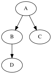
digraph MyGraph {
	A -> B -> D
	A -> C
}
Graphviz comes with a handful of tools that allow you to render these graph definitions into different output formats, including PDF, PNG, or SVG. The short sample graph from above would look like this:

It’s a fantastic tool to document flows and all kind of graph like structures.
Using Golang to Generate Graphviz Files
When I was working on the grails applications in question, I always had trouble understanding the complex service structure. There’s a lot of them, and they all depend on other services. And that complicates making changes and is a potential source of mistakes.
Looking at the services and their dependencies I realized it was a graph and that with a little bit of work I could get a Graph definition in the dot language. I decided to go with Go, just to have some fun and get my mind off Groovy and Java and luckily there is already a full fledged graphviz Go implementation which made things easy.
The actual Go app is quite straightforward and very hackish. Given a start directory, it traverses all subdirectories and finds all .groovy files that are either controllers or services which are added as Nodes in the graph. Then it scans each line for service definitions which are luckily name based. This involves a fair bit of string processing and has lots of flaws. Once a service definition is found, it is added as an edge to the graph. Repeat until everything has been processed and write out the .dot file, run it through dot, and enjoy the visualization.
Examples
Here are the scrubbed graphs from two of the apps I’m working on. They are huge, so click the link to get the full resolution version. Don’t mind the silly names, I had to scrub a lot of the original names.
 App A Full Resolution[PNG 558K]
 App B Full Resolution[PNG 393K]
Analysis
Looking at the generated Graphs, several things quickly became apparent. First of all, it’s very easy to see what services have the most afferent dependencies. This by itself makes it easy to spot crucial pieces of code that provide shared functionality to many other components.
But even more so, the layering of the services becomes apparent. Graphviz orders the nodes vertically based on the number of afferent and efferent dependencies. And at the bottom of the graph, you have all the services with only afferent dependencies which form the foundational layer of your application. This is the code that everything in your app relies on, either directly or transitively.
Further Ideas
Visualizing application structures is an incredibly useful, especially when working on complex and complicated systems. The above script took me less than an hour to write and the return is tremendous. I can now easily determine what to work on, what change could potentially affect other parts of the systems, and I can finally see the architecture of the application.
So far the visualization is rather simple. Bubbles for controllers and octagons for services. But there’s so much more that could be done:
- Calculate the transitive number of dependencies a component has and adjust the size of the visual representation based on that. For example, a service used only by a single controller would be fairly small. Another service, used by twenty other services would be much bigger and more prominent. Fairly easy to implement.
- Use afferent and efferent coupling to calculate the instability of services. Originally a metric for packages, this could probably applied to services as well. Could be visualized with border thickness of shapes.
- Support different types of artifacts and give them different shapes. Right now I’m thinking quartz jobs which play a fairly important role in our application.
- Parse code instead of string searching. Right now I’m simply scanning each source file line by line and search for certain patterns. This works reasonably well, but with some apps I get unwanted values. Sometimes from comments, sometimes other values. If I were to actually parse the source into an AST, all these issues would disappear. It would also allow a host of other interesting things, like:
- Calculate the Cyclomatic Complexity for each component and use that to colour code the visual representation. Low complexity could be a green tint, high values would be red.
- Support different languages and frameworks. I was able to implement this tool very easily because Grails’ service and controller naming follows an entirely name based convention. That makes finding service definitions trivial. I would love to extend this tool to support different languages and frameworks.
- Have more ideas? Drop me an email or a comment! :)
The source code for the app is rather messy, but you can find it on github.com/ilikeorangutans/grails-service-visualizer.